Web Design
2017/05/22
Slight Update of my Blog Design (Version5.3)
Slight updates have been taking place in Version 5.x of my blog design these days. And I did update it slightly today.
- I changed the design of h3 heading tags from ribbon to checkbox, and changed the design of h4 heading tags from blue bubbles in the beginning to simple blue bold letters.
- I widened the top and bottom margin of the main paragraphs of single post so that I can recognize post title and main paragraphs very well.
- I changed the the color of page navi into blues, and added text shadow to "・・・".
- I improved the text shadow of the blog title.(text-shadow: 1px 1px 3px #000000, -1px 1px 3px #000000, -1px -1px 3px #000000, 1px -1px 3px #000000, 1px 0px 3px #000000, 0px 1px 3px #000000, -1px 0px 3px #000000, 0px -1px 3px #000000;)
- I changed the javascript of the hero header from "changing image urls each time" to "loading all the images in the beginning". And I added a fade-in effect when loaded.
There are many changes this time, but indeed, we cannot find clear differences in the appearance so I uploaded only one screenshot of the change 1 to record it.

"1. What is Minamizawa Hydrangea Mountain?" is the big heading tag of h3, and "Summary of the Project" is the small heading tag of h4. Both are blues. Maybe they are well-organized, simple but appealing.
...I might soon want to change them. Try and error is important.
Enjoy the posts of the same category!
Web Design
2018/08/10
Slight Update of my Blog Design (Version5.4)
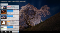
Web Design
2017/05/21
Reviewing the History of my Blog Designs during the last Three and a Half Years (Version 0.x - 5.x)

Web Design
2017/04/27
Slight Update of my Blog Design (Version5.2)
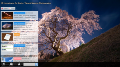
Web Design
2017/04/22
Slight Update of my Blog Design (Version5.1)
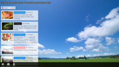
Web Design
2017/03/18
Adopting Hero Header into my Blog Design (Version5.0)
Author of this Blog
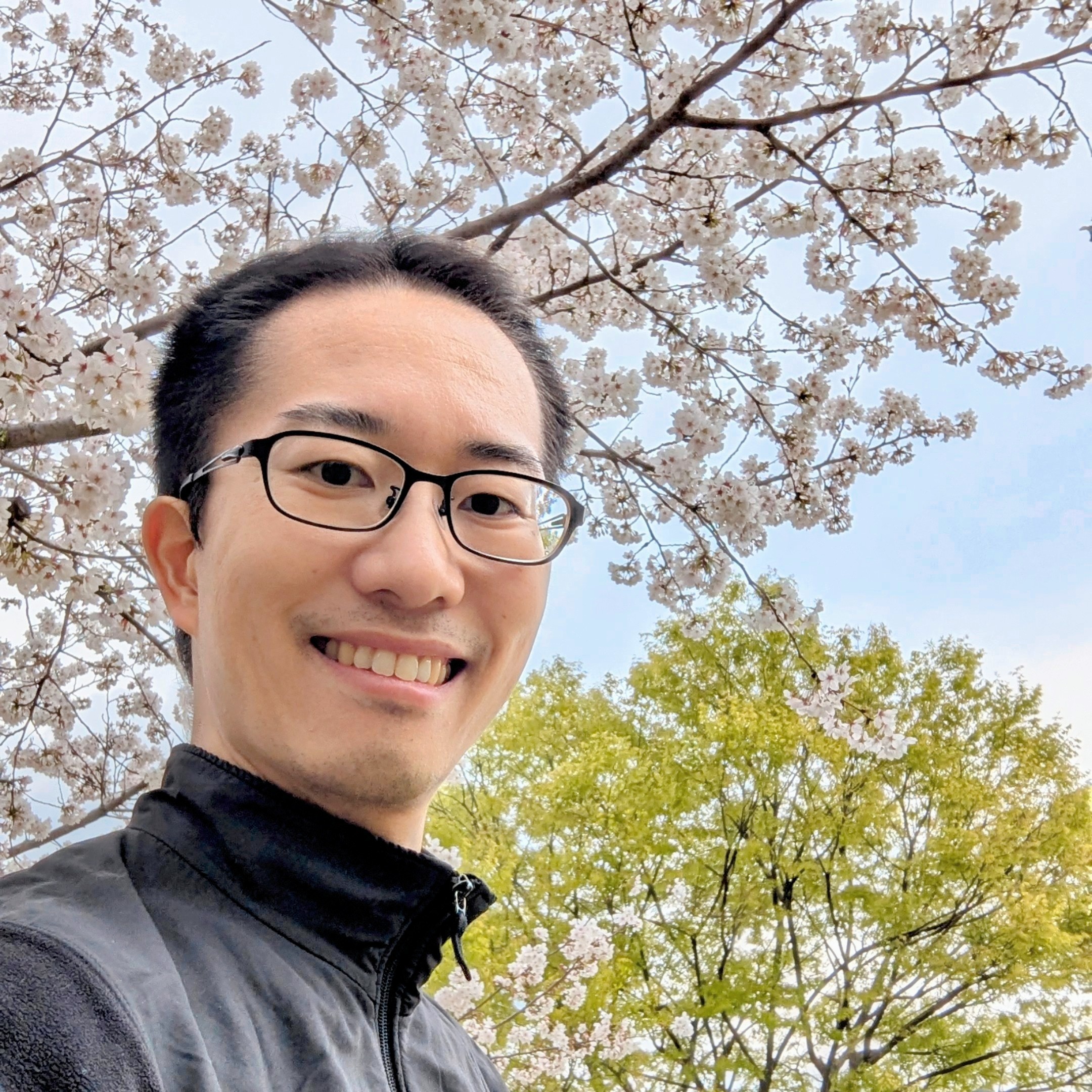
Takumi Nasuno. Tanagura Supporters' Ambassador (Official supporter of Tanagura Town of Fukushima Prefecture). A fan of now-defunct TRIPLESSO. A multi-language blogger who loves photography and handcraft, montains, waterfalls and autumn foliage. I'm engaged in knowledge management and data analytics.
Blog Category
- Business (6)
- Childcare (1)
- Food (19)
- Languages (2)
- Life Hack (1)
- Local Revitalization (69)
- Photography (571)
- Web Design (11)