Adopting Hero Header into my Blog Design (Version5.0)
I've finished changing my blog design today. The key word is "Adopting Hero Header", and now this is the design of the year 2017. Before checking the change, I would like to review what I posted on March 9.
So the policy of this time's design change is...
- to use minimal design and hero header on the toppage
- to use global navigation of icon plus text
- to add animation in screen transition
- to adopt material design as much as possible
Please look forward to the result of my challenge!
Then, let's see how my blog has changed in its appearance.
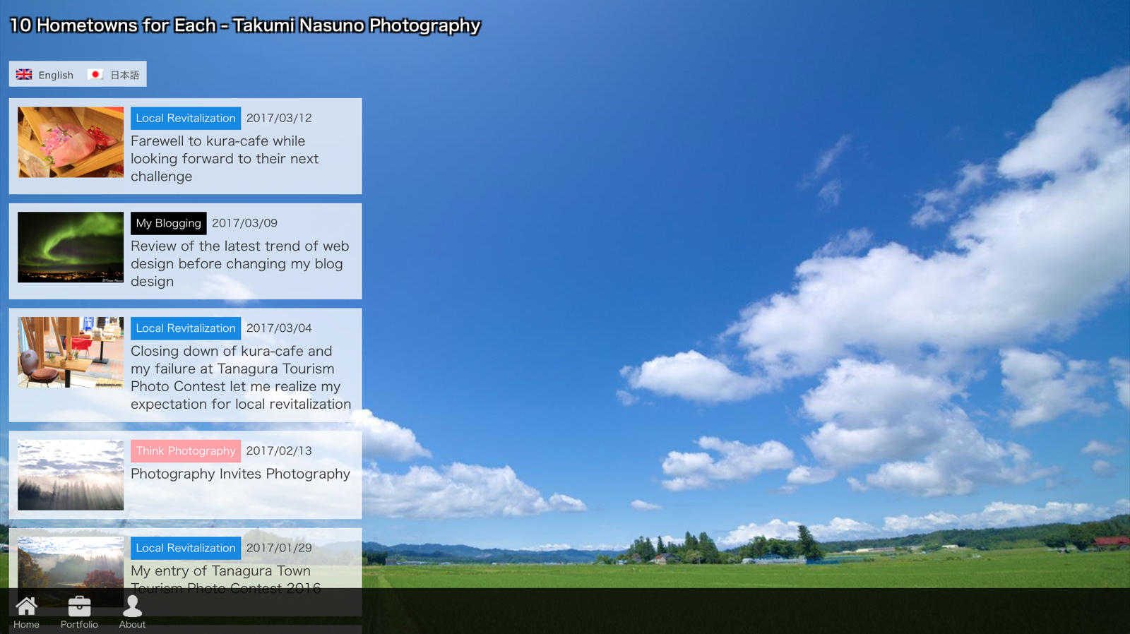
Before

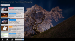
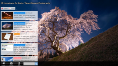
After
It looks like the combination of hero header and minimal design is pretty useful in telling an atmosphere of own worldview.
Currently I'm using 6 photogenic views of Tanagura Town for the hero header, but because of the possible delay of downloading heavy photos, I decided to compress them by 25%... This is a big challenge to realize beautiful but light photo files so far.
By the way, it is a big burden to conduct cross-decice testing and cross-browser testing... Why do they show websites in a slightly different way? I really want a global standard...
Anyway, now the design is ready for 2017, and I can concentrate on writing contents.


- Business (6)
- Childcare (1)
- Food (19)
- Languages (2)
- Life Hack (1)
- Local Revitalization (69)
- Photography (571)
- Web Design (11)
