Re-change of single column width from 800px to 720px
I changed the blog design.
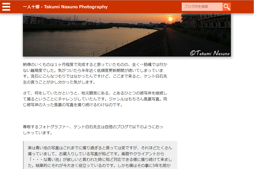
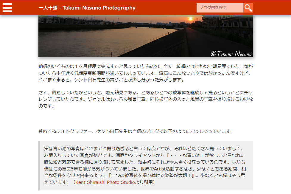
To be concrete, I narrowed the width of single column on PC from 800px to 720px. ( Note that the screenshots below are from posts in Japanese.)
*before
*after
Before this change, I widened the width of the whole column to 800px and narrowed the width of passages to 80% of the column, aligned to the left because I wanted to show larger photos while narrowing passages as much as possible. This is a tricky design, and I had thought that it would work.
However, it looks somewhat strange when the right edge of photos and that of passages are not aligned.
The strangeness got bigger as the day went by, and I ended up being unable to put up with it. I unified them to 720px. I read an online article saying that easy-to-read column width is usually from 600px to 720px. I guess this new design is the largest to the extent possible.
Hmm... I'm not that clear yet. The volume of information on one screen is quite limited. I might re-adopt two column design in the near future...




- Business (6)
- Childcare (1)
- Food (19)
- Languages (2)
- Life Hack (1)
- Local Revitalization (69)
- Photography (571)
- Web Design (11)
